Achieving luxury status isn’t about having a pretty feed; it’s about engineering a strategic ‘Visual Grammar’ that systematically builds perceived value and authority.
- Visual consistency isn’t just aesthetic; it’s a psychological tool for building brand recognition and signaling authority through deliberate color and typographic choices.
- Authenticity and aspiration are not mutually exclusive. The most effective strategies blend raw, user-centric content within a highly controlled, aspirational framework.
Recommendation: Audit your brand’s visual language not for its beauty, but for its strategic coherence across all touchpoints—from Instagram grid pacing to the sensory feedback of its packaging.
For a niche beauty brand aspiring to luxury status, the common advice is to cultivate a “consistent aesthetic” and use “high-quality photos.” This is the entry ticket, not the winning formula. Many brands achieve a clean, polished look yet remain forgettable, failing to command a premium. They speak a generic visual language that communicates competence but not authority. The challenge isn’t merely to look expensive; it’s to construct a narrative so compelling that price becomes a secondary consideration. This requires moving beyond surface-level aesthetics to understand the deep structure of visual communication.
The real pitfall lies in mistaking a collection of beautiful images for a story. True luxury brands don’t just post content; they build worlds. They understand that every visual element—from the deep blues signaling heritage to the satisfying click of a lipstick case—is a word in a carefully constructed language. They masterfully balance the aspirational pull of professional editorial content with the relatable touch of authenticity, creating a dynamic that feels both exclusive and personal. The failure to grasp this strategic depth is what separates fleeting trends from enduring icons.
But what if the key wasn’t simply consistency, but a deliberate and strategic ‘Visual Grammar’? This is a system of rules, cues, and narrative structures that transforms a brand’s visual output into a powerful engine of perceived value. This article deconstructs this grammar. We will explore how color choices signal authority, how to pace a narrative across a digital grid, and why the sensory experience of packaging is the final, crucial sentence in your brand’s story. It’s time to stop decorating and start communicating.
To fully grasp how these elements work together, this article breaks down the core components of a luxury visual strategy. The following sections will guide you through each layer of this ‘Visual Grammar’, from foundational color theory to advanced sensory marketing.
Summary: How Visual Storytelling Elevates a Niche Beauty Brand
- Why Heritage Brands Use Deep Blues and Golds to Signal Authority?
- How to Plan a 9-Grid Layout That Tells a Linear Story?
- Authenticity or Aspiration: Which Visual Style Sells High-Ticket Creams?
- The Branding Disconnect That Confuses Customers Between Web and Insta
- When to Shift Visual Tones From Summer Glow to Winter Repair?
- The “Blanding” Phenomenon: Why All Tech Logos Look the Same
- Why a Signature Adds 50% Value to an Otherwise Identical Print?
- Why Sensory Packaging Is the Silent Salesman for Premium Cosmetics?
Why Heritage Brands Use Deep Blues and Golds to Signal Authority?
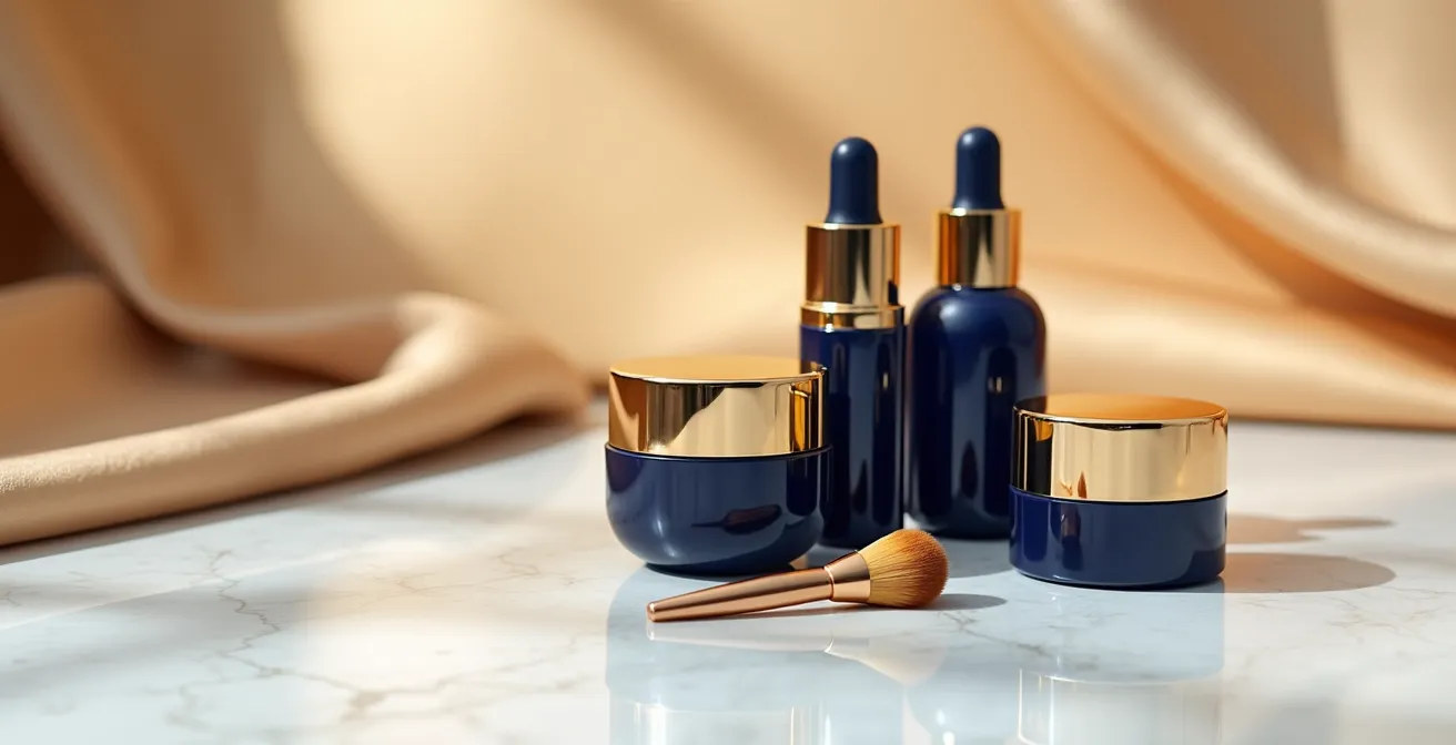
Color is the first word in a brand’s visual grammar, and in the language of luxury, certain “words” carry more weight. Deep blues, like navy or cobalt, are psychologically associated with stability, wisdom, and trust—qualities inherent to established institutions like banks, universities, and, by extension, heritage brands. Gold is not merely a color; it’s a direct symbol of wealth, quality, and timeless value. When a brand combines these two, it’s not a simple aesthetic choice. It is a strategic statement, a visual shortcut to communicate legacy and authority, even if the brand is new. This code suggests that the product is not a fleeting trend but an investment, backed by a deep, almost regal, sense of confidence.
The power of this strategy lies in its ability to build an instantaneous cognitive framework for the customer. Before they read a single word of copy, their brain has already processed these color cues and placed the brand in a “premium” category. This is crucial in a saturated market where differentiation is paramount. Indeed, research shows that using consistent signature colors can boost brand recognition by up to 80%. When a brand “owns” a color combination, its visual presence becomes unmistakable, a form of aesthetic authority that competitors struggle to replicate without appearing derivative.
Consider the DTC brand Glossier. While not a “heritage” brand in the traditional sense, it masterfully built its authority through an unwavering commitment to its visual code—a specific shade of millennial pink and clean, minimalist typography. This consistency made every post instantly recognizable, creating a modern form of aesthetic authority. Their community-centric approach, which features real customers in about half of their feed, further solidifies this by making their audience feel like insiders to an exclusive, yet welcoming, world. This demonstrates that authority isn’t just about projecting a historic past; it’s about establishing an undeniable and consistent visual present.
Ultimately, whether through the old-world gravitas of blue and gold or the new-world cult status of a signature pink, color is the foundational syntax that allows a brand to declare its position in the market hierarchy without uttering a word.
How to Plan a 9-Grid Layout That Tells a Linear Story?
The Instagram 9-grid is the modern brand’s opening statement. For a luxury brand, it cannot be a mere gallery of pretty pictures; it must function as a curated exhibition, a triptych that unfolds a deliberate narrative. Planning a linear story across this format requires a shift in thinking from individual posts to a cohesive visual sentence. The goal is to control the narrative pacing, guiding the viewer’s eye and emotion from one frame to the next. This could be a micro-story showing a product’s journey from raw ingredient to finished ritual, or a macro-story transitioning through a mood or season.
This approach demands meticulous forward planning, often using apps to visualize the grid’s flow before anything goes live. The story should have a clear beginning, middle, and end that is visible when viewing the 3×3 profile layout. This creates a powerful first impression for new followers, communicating a level of intentionality and creative direction that is synonymous with luxury. The visual below conceptualizes this flow, showing how distinct images can connect to form a single, progressive narrative.

As this layout suggests, the journey is key. The first row might establish the problem or the raw, natural inspiration. The middle row could introduce the solution—the product, its texture, its application. The final row then delivers the aspirational outcome: the glow, the confidence, the transformed state. This structure transforms a passive scroll into an active discovery. The customer isn’t just seeing products; they are following a plot, making them more invested in the final reveal. This method elevates the grid from a simple marketing channel to a dedicated storytelling canvas.
By treating the 9-grid as a single, coherent narrative unit, a niche brand can project a level of strategic thinking and artistry that immediately elevates its status, proving that its vision extends far beyond a single, isolated moment.
Authenticity or Aspiration: Which Visual Style Sells High-Ticket Creams?
The debate between authenticity (raw, user-generated content, behind-the-scenes) and aspiration (polished, editorial, model-focused) is a false dichotomy for luxury beauty brands. The most successful strategists understand that the goal isn’t to choose one, but to masterfully blend them. Given that studies show 92% of consumers cite visual factors as most important in their purchasing decisions, the *type* of visual becomes a critical lever for sales. For high-ticket items, pure aspiration can feel distant and cold, while pure authenticity can lack the perceived quality and magic that justifies a premium price.
The solution is a curated ecosystem where authenticity serves the aspiration. The highly polished, dream-like campaign shots create the desire and establish the brand’s world. The authentic, “unfiltered” content—like a founder’s story, a user’s unboxing video, or a peek into the lab—provides the ‘proof’. It grounds the dream in a relatable reality, making the aspirational promise feel attainable. As the strategists at Cleo Social note in their analysis, “Curating an ‘Unfiltered’ But Cohesive Instagram Grid in 2024”:
In a time where authenticity and spontaneity rule the content world, it’s no secret that we are collectively drawn to the raw, unfiltered, and relatable side of social media. However, amidst this shift, it’s important to remember your Instagram grid is more than just a collection of pretty pictures—it’s your brand’s digital diary, an introduction to who we are as a company, and a warm handshake to those who curiously explore our profiles.
– Cleo Social, Curating an ‘Unfiltered’ But Cohesive Instagram Grid in 2024
This “warm handshake” is what converts interest into trust. A high-ticket cream isn’t just a formula; it’s a belief system. The aspirational visuals make the customer believe in the *result*, while the authentic content makes them believe in the *brand*. The key is to ensure the authentic content still lives within the brand’s visual grammar. A user-generated photo, for example, should be reposted because it naturally aligns with the brand’s color palette and ethos, not just because it features the product. This maintains aesthetic control while celebrating the community, creating a powerful loop of engagement and perceived value.
Therefore, the visual style that sells high-ticket creams is a sophisticated hybrid: one that uses the raw power of authenticity to make an otherwise untouchable dream feel personal and within reach.
The Branding Disconnect That Confuses Customers Between Web and Insta
What often appears as a “branding disconnect” between a beauty brand’s vibrant, lifestyle-driven Instagram and its clinical, conversion-focused website is, in the hands of a skilled strategist, a deliberate act of ‘visual code-switching’. The platforms serve different functions in the customer journey, and therefore, require different dialects of the brand’s visual language. Instagram is the top of the funnel: a space for discovery, inspiration, and community building. Its goal is to stop the scroll with high-contrast, aspirational imagery. The website, particularly the product page, is the bottom of the funnel: a space for consideration and conversion. Its goal is to build trust and provide clarity with clean, detailed, and informative visuals.
A customer confused by this shift is a sign of poor strategy, but a customer who is seamlessly guided from one to the other is a sign of mastery. The link is the overarching brand grammar—consistent typography, core color accents, and tone of voice—that ties the two experiences together. The Instagram post creates the ‘why’ (the dream, the lifestyle), while the product page delivers the ‘how’ (the ingredients, the benefits, the proof). Forcing the same visual approach on both platforms is inefficient: a purely clinical feed would fail to inspire on Instagram, and a purely lifestyle-focused product page would fail to convert serious buyers.
This platform-specific approach can be broken down strategically. A recent analysis of visual strategies in the beauty industry highlights these distinct goals. The table below illustrates how a luxury brand might tailor its visual content to the unique purpose of each channel.
| Platform | Visual Goal | Content Type | Engagement Focus |
|---|---|---|---|
| Stop the scroll with high contrast | Aspirational lifestyle, models | Discovery & awareness | |
| Website Product Page | Inform and convert | Clinical macro shots, detailed views | Conversion & trust |
| YouTube | Educational depth | In-depth tutorials, reviews | Education & authority |
Scrolling through Hailey Bieber’s Rhode Skincare account, for example, feels like exploring personal mood boards that change color stories over time. However, the products are a consistent, recognizable anchor. This ensures that when a user clicks through to the website, the product itself is the familiar bridge, even as the visual context shifts from aspirational mood to functional information. This is not a disconnect; it is a purpose-driven visual journey.
The true measure of a strong visual strategy is not rigid uniformity across all channels, but an intelligent, fluid adaptation that respects the user’s mindset and intent on each platform, guiding them smoothly from inspiration to purchase.
When to Shift Visual Tones From Summer Glow to Winter Repair?
Shifting visual tones with the seasons is a classic tactic, but for a luxury brand, it must be executed as a deliberate chapter in a year-long narrative, not an abrupt change in filters. The transition from a “Summer Glow” aesthetic—often characterized by bright, high-exposure shots, sun-drenched skin, and vibrant colors—to a “Winter Repair” mood—with its softer lighting, richer textures, and cozy, introspective feel—is an opportunity to demonstrate a deeper understanding of the customer’s life and needs. The key is to frame this shift not as a marketing pivot, but as an empathetic response to the changing environment and its effect on skin.
A sophisticated strategy avoids sudden changes. Instead, it employs a transitional period of 2-3 weeks, using “visual bridges” to smoothly guide the audience. This might involve gradually introducing cooler tones, shifting from outdoor beach scenes to indoor, fire-lit settings, and slowly changing the styling from lightweight linens to cashmere. The product storytelling evolves in parallel: the focus moves from protection (SPF, antioxidants) to deep nourishment and restoration (rich creams, barrier repair). This creates a sense of continuity and foresight, reinforcing the brand’s role as an expert guide for the customer’s skin journey throughout the year.
Furthermore, the most advanced brands tie these visual shifts to universal “emotional seasons.” September, for instance, isn’t just the start of autumn; it’s a ‘Back-to-Focus’ period for many. A brand can mirror this with sharper visuals, more structured compositions, and a tone that speaks to routine and efficacy. To execute this effectively, brands should consider the following strategic pillars for seasonal storytelling:
- Frame seasonal shifts as premeditated ‘chapters’ in a year-long story of your customer’s skin journey.
- Use a transition period with ‘Visual Bridges’ to gradually introduce new tones and lighting.
- Tie visual shifts to ’emotional seasons’ that are universal (e.g., ‘renewal’ in spring, ‘reflection’ in winter).
- Blend education (why skin needs change) with transformation (the visible results of adapting your routine).
- Ensure the story arcs remain immersive and consistent with the brand’s core visual grammar.
By orchestrating these transitions with grace and intention, a niche beauty brand proves it’s not just selling products; it’s offering a responsive, year-round partnership in its customer’s well-being, a hallmark of true luxury service.
The “Blanding” Phenomenon: Why All Tech Logos Look the Same
While the beauty industry has its own unique visual codes, it is not immune to the broader design trend of “blanding”—the convergence toward a safe, minimalist, and often indistinguishable aesthetic. This phenomenon, most visible in the tech world where countless brands adopted near-identical sans-serif logos, poses a significant threat to luxury positioning. Luxury is built on distinction, character, and a point of view. Blanding is the abdication of all three. It stems from a misguided belief that ‘minimalist’ and ‘premium’ are synonymous, when in fact, lazy minimalism is often just generic. The issue isn’t simplicity itself, but the lack of ownable character within that simplicity.
This homogenization is fueled by data suggesting that less is more. For instance, research reveals that 95% of top brands use just one or two colors in their logos. While this points to the power of a focused palette, it can also become a creative trap, leading brands to choose the same safe, neutral tones. For a niche beauty brand, falling into this trap is fatal. Its visual identity is its primary weapon against larger, mass-market competitors. Adopting a generic, “bland” aesthetic is like showing up to a duel with a butter knife. It communicates a lack of confidence and imagination, two qualities antithetical to luxury.
The antidote to blanding is a return to bespoke, character-rich visual elements, particularly in typography. An ornate serif font, a custom-drawn logomark, or unique ligatures can inject a level of artistry and personality that a standard sans-serif font cannot. It communicates craft, attention to detail, and a unique heritage (even if that heritage is newly invented). The contrast between a distinctive, textural typography and a flat, minimalist one is the difference between a signature and a label.
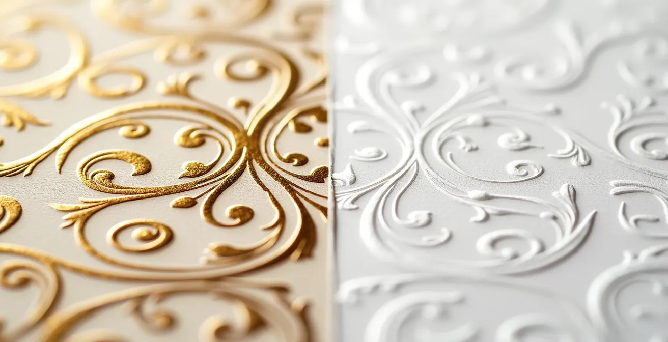
As the visual comparison shows, texture, form, and intricacy create an immediate perception of value and craft. A brand’s choice of typeface is not a minor detail; it is the very tone of its written voice. A niche brand must consciously choose a typeface that feels as unique as its formulations. To stand out, a luxury brand cannot afford to look like everyone else. It must have the courage to be beautifully different, not just minimally clean.
In the pursuit of luxury status, distinctiveness is not a feature; it is the entire foundation. Blanding is the quiet erosion of that foundation, a slow surrender to the forgettable middle.
Why a Signature Adds 50% Value to an Otherwise Identical Print?
In the art world, an artist’s signature can be the sole differentiator between a poster and a priceless original. This concept translates directly to luxury branding. A “signature”—whether a literal founder’s mark, a unique design motif, or an inimitable aesthetic style—is what transforms a product from a mere commodity into a collectible artifact. It functions as a psychological seal of approval, a guarantee of intention, authenticity, and origin. This is the pinnacle of aesthetic authority: when the brand’s visual grammar becomes so distinctive that it acts as its own signature, instantly recognizable and imbued with value.
The value addition is not arbitrary; it’s rooted in the human desire for rarity and a direct connection to the creator. A signature proves that the item is not a soulless, mass-produced object but the result of a specific vision and a personal touch. For a niche beauty brand, cultivating this signature is paramount. It could be a unique packaging detail, like a hand-tied knot. It could be a recurring visual element in its photography, like a specific type of shadow or flower. Or it could be the founder’s story and ethos, deeply woven into the brand’s narrative, making them the symbolic “artist” behind the work.
National Geographic, a legacy brand, exemplifies this by ensuring all its content ties back to its core pillars of exploration and science. As Marketing Scoop’s analysis of their strategy notes, they have masterfully evolved their storytelling for new mediums while “staying true to their core identity.” This identity acts as their signature. For a beauty brand, this means that every visual choice must be a deliberate brushstroke contributing to a larger, signed masterpiece. This is why a product from a brand with a strong, signature-like identity commands a higher price than a chemically identical product from a generic brand. The customer is not just buying a cream; they are buying a piece of a specific, curated world—they are buying the artist’s touch.
Ultimately, a signature is the most concise form of a story. It says, “This was made by someone, with a purpose, for you.” In the anonymous landscape of modern commerce, that personal guarantee is the ultimate luxury.
Key Takeaways
- Luxury visual storytelling is not about beauty, but about engineering a strategic ‘Visual Grammar’ to build perceived value and authority.
- True differentiation comes from developing a unique, character-rich aesthetic that actively resists the trend of “blanding” and generic minimalism.
- The ultimate luxury experience is multi-sensory; the visual narrative must extend beyond the screen into the tactile and auditory cues of the physical product packaging.
Why Sensory Packaging Is the Silent Salesman for Premium Cosmetics?
The visual story that begins on a screen finds its final, climactic chapter in the customer’s hands. For a luxury cosmetic, the packaging is not a container; it’s a physical embodiment of the brand promise. It is a silent salesman that uses touch, weight, and sound to communicate quality long after the marketing visuals have faded. This is where ‘sensory cues’ become critical. The substantial heft of a glass jar, the satisfying magnetic ‘click’ of a lipstick case, the smooth matte finish of a box—these are all non-verbal signals that build a powerful, subconscious case for the product’s value. The experience of unboxing a luxury item should be a ritual, a continuation of the aspirational narrative.
Brands that master this understand that the sensory experience can be as compelling as the product’s functional benefits. A prime example is Valentino Beauty’s innovative pop-up at Dubai Airport. They introduced a unique ‘ASMR station’ where guests could don headphones and experience the products through sound. As highlighted in a Trend-Hunter report on the experience, this allowed travelers to hear “the click of a lipstick tube and the spritz of perfume,” creating a multi-sensory connection to the brand. This strategy brilliantly transforms mundane product interactions into a memorable and intimate form of entertainment, deepening the customer’s emotional bond with the products before they even touch them.
This focus on auditory and tactile feedback is the final frontier for niche brands aiming for luxury status. It’s an area where meticulous attention to detail can create a significant competitive advantage. A generic plastic pump that squeaks or a lightweight cap that feels flimsy can instantly shatter the carefully constructed illusion of luxury. Conversely, a pump that dispenses product with a smooth, silent glide or a cap that twists shut with a satisfying ‘thud’ reinforces the perception of superior engineering and quality. It’s the final confirmation that the product is worth its premium price.
Action Plan: Auditing Your Sensory Packaging
- Points of Contact: List all physical interactions a customer has with your packaging, from the outer box to the primary container. Note every touchpoint: unsealing, opening, holding, and closing.
- Collect: Inventory the existing sensory elements. Record the sounds (clicks, rustles), textures (matte, gloss, embossed), and weight of each component. Be specific (e.g., “lid closes with a sharp plastic snap”).
- Coherence: Confront these sensory cues with your brand’s core values. Does the “sharp plastic snap” align with a brand promise of “soft, gentle luxury”? Identify the disconnects.
- Memorability & Emotion: Assess each sensory cue. Is the sound satisfying or irritating? Is the texture unique or generic? Does it evoke a feeling of quality, or is it forgettable?
- Plan for Integration: Prioritize fixing the most jarring sensory disconnects. Plan to replace generic components with custom-designed elements that produce satisfying sounds and feel substantial.
By engineering these sensory details, a brand ensures that its story is not just seen or read, but felt. This tactile confirmation of quality is the most powerful closing argument a luxury brand can make.