The return to maximalism is not a simple pendulum swing of taste, but a deliberate cultural and economic corrective to a decade of perceived digital sameness and aesthetic austerity.
- Minimalism, often triggered by economic uncertainty, created a “sea of sameness” and a phenomenon known as “blanding,” particularly in the tech sector.
- Maximalism acts as a counter-movement, reintroducing narrative richness, individuality, and visual storytelling as markers of authenticity and luxury.
Recommendation: Brands should analyze this shift not as a fleeting fad to be copied, but as a signal to reassess whether their visual identity communicates authentic value or has fallen into generic safety.
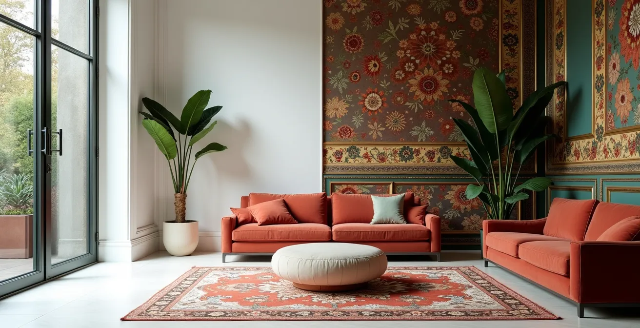
For the better part of a decade, the design world has been under the serene, uncluttered dominion of minimalism. From our interfaces to our interiors, the prevailing ethos was one of reduction: clean lines, negative space, and a muted palette. It promised a sense of calm in a chaotic world. Yet, a palpable shift is underway. A collective craving for richness, texture, and unapologetic personality is bringing maximalism back from the aesthetic wilderness. The clean, sans-serif logos are beginning to feel sterile, and the perfectly curated, sparse rooms now sometimes feel empty rather than peaceful.
It is tempting to view this as just another turn of the trend cycle, the predictable pendulum swinging from one extreme to the other. However, such a view misses the deeper currents at play. The exhaustion with minimalism is not merely aesthetic boredom; it is a reaction to the social, economic, and technological forces that elevated it to a default philosophy. The rise of digital platforms demanded simple, scalable logos, leading to a visual homogenization often termed “blanding.” Simultaneously, periods of economic uncertainty have historically fostered an appreciation for quiet, long-lasting quality over ostentatious displays.
This article argues that the resurgence of maximalism is a corrective cycle. It is a pushback against a decade of what could be called aesthetic austerity, a conscious re-embrace of visual abundance as a form of expression and storytelling. We will explore the economic roots of minimalist dominance, dissect the tools used to identify emerging aesthetic waves, and analyze the strategic tightrope walk brands must perform between classic endurance and contemporary relevance. This is not just about more stuff; it’s about the return of narrative.
To understand this complex dynamic, this analysis will deconstruct the key forces at play, from the psychology of recessions to the semiotics of luxury branding. The following sections offer a critical framework for designers and cultural observers to navigate this evolving visual landscape.
Summary: The Cyclical Battle Between Minimalist Serenity and Maximalist Expression
- Why Recessions Often Trigger Minimalist Design Trends?
- How to Spot the Next Aesthetic Wave Before It Hits Mainstream?
- Classic or Current: Which Design Strategy Builds Long-Term Brand Equity?
- The “Blanding” Phenomenon: Why All Tech Logos Look the Same
- When to Jump on a Trend vs When to Ignore It as “Too Late”?
- Fads vs Shifts: Which One Should Drive Your 5-Year Strategy?
- Why Heritage Brands Use Deep Blues and Golds to Signal Authority?
- How Visual Storytelling Elevates a Niche Beauty Brand to Luxury Status?
Why Recessions Often Trigger Minimalist Design Trends?
The ascendancy of minimalism is rarely a purely aesthetic choice; it is often deeply intertwined with economic psychology. During periods of financial uncertainty, consumer behavior pivots towards safety, longevity, and perceived value. Flashy, ephemeral trends are viewed with suspicion, while designs that communicate durability and quiet confidence gain traction. This creates a fertile ground for minimalism, which champions the idea of “less but better.” The focus shifts to quality materials, timeless forms, and an absence of adornment, suggesting an investment that will outlast economic turbulence. This aesthetic of scarcity signals prudence and a discerning eye.
However, this preference is not universal. The appeal of minimalism is often class-dependent. For those with the luxury of choice, a sparse environment can feel calming and controlled. Research indicates that clutter-free spaces help lower cognitive overload and enhance mental clarity by reducing excessive visual stimuli. Yet, this perspective can be inverted. For consumers focused on practical value, minimalism can be perceived negatively. In fact, research from Psychology & Marketing reveals that consumers with lower socioeconomic status may show less favorable evaluations of minimalist brands, associating the lack of visual cues with a lack of quantity or value.
Therefore, minimalism’s dominance during a recession is a complex phenomenon. It serves as a psychological balm for some, offering a sense of order amidst chaos. For others, it represents a form of aesthetic austerity that feels restrictive rather than liberating. The trend’s power lies in its ability to reflect a collective mood of cautious consumption, even as it alienates those who do not share its underlying cultural assumptions. The eventual fatigue with this austerity is a primary driver of maximalism’s return.
How to Spot the Next Aesthetic Wave Before It Hits Mainstream?
Anticipating the next major aesthetic shift is less about clairvoyance and more about a form of digital anthropology. Before a trend like maximalism hits the commercial mainstream, it leaves a trail of signals in niche cultural corners and adjacent creative fields. The key is to look beyond the immediate sphere of design and monitor the spaces where visual experimentation is happening with the least commercial pressure. These are the laboratories where the aesthetics of tomorrow are born.
The process involves observing shifts in both visual language and discourse. For instance, the art direction in independent video games or the cover designs of speculative fiction novels often pioneer color palettes and compositional styles years before they appear in branding. Likewise, niche online communities on platforms like Discord or Reddit are powerful incubators. The slang, memes, and imagery that gain traction within these subcultures can be early indicators of a broader societal mood shift. Spotting a trend is about identifying a recurring pattern of rebellion against a dominant aesthetic—in this case, a growing use of organic textures, vibrant colors, and complex compositions as a reaction to flat, minimalist design.
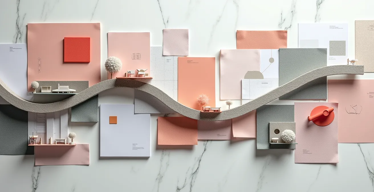
As the image suggests, this process combines looking at a wide array of sources—from digital platforms to physical materials—to synthesize a coherent direction of movement. It’s about mapping the connections between seemingly disparate cultural outputs to find the underlying narrative. The following framework provides a structured approach to this form of trend analysis.
Action Plan: A Framework for Identifying Emerging Trends
- Monitor Adjacent Fields: Track the art direction in video games, speculative fiction, and independent films for early visual signals.
- Practice Digital Anthropology: Analyze language and imagery shifts in niche online communities on Discord, Reddit, and TikTok to gauge emerging cultural sentiments.
- Look for Counter-Movements: Identify the dominant algorithmic aesthetics (e.g., “clean girl” minimalism) and actively search for their opposites, as these often signal the next wave.
- Follow Material Innovation: Pay attention to new materials and production techniques in fashion and architecture, as they often enable new aesthetic possibilities.
- Analyze AI-Generated Art: Watch for recurring themes and styles in AI-generated images that gain popularity, as they reflect a collective visual consciousness and can seamlessly integrate into brand identities.
Classic or Current: Which Design Strategy Builds Long-Term Brand Equity?
The tension between timelessness and trendiness is a central challenge in brand strategy. Chasing every new aesthetic wave risks appearing fickle and diluting brand identity, a path that can lead to short-term relevance but long-term erosion of equity. Conversely, rigidly adhering to a classic identity can make a brand seem staid and disconnected from the contemporary cultural conversation. The most resilient brands master a hybrid approach: they maintain a stable, classic core while allowing for trendy layers that can be updated or shed as the aesthetic climate changes.
A “classic core” is built on enduring brand assets: a distinctive logo, a consistent tone of voice, and a foundational color palette that communicates the brand’s fundamental values. For luxury brands, this often involves a specific visual language. For instance, a 2025 study from the Journal of Consumer Research demonstrates that using less saturated colors can enhance the perception of a luxury brand’s heritage and status. This is because muted tones are psychologically associated with the passage of time, suggesting continuity and authenticity. This classic foundation ensures the brand remains recognizable and stable.
“Trendy layers,” on the other hand, are the ephemeral elements: seasonal campaigns, pop-up collaborations, or social media aesthetics. These are opportunities to engage with the current moment without altering the brand’s DNA. The following table breaks down the strategic implications of these different approaches.
| Strategy | Risk Level | Brand Equity Impact | Example |
|---|---|---|---|
| Classic Core | Low Risk | Stable, Long-term | Patagonia’s Environmental Ethos |
| Trendy Layers | High Risk | Short-term Boost | Pop-up Collaborations |
| Hybrid Approach | Balanced | Sustained Growth | Burberry’s revival of classic emblem |
Ultimately, building long-term equity is not an “either/or” proposition. It requires the discipline to protect a brand’s core identity while having the flexibility to participate in current trends in a way that feels authentic, not reactive. This balanced strategy allows a brand to evolve without losing itself.
The “Blanding” Phenomenon: Why All Tech Logos Look the Same
One of the most significant catalysts for the maximalist backlash is a phenomenon known as “blanding.” It describes the widespread trend, particularly acute in the tech and direct-to-consumer sectors, of brands stripping their visual identities down to a generic, minimalist formula: a geometric sans-serif typeface, a simple icon, and a safe, often muted, color palette. While the initial intent was to create clean, modern, and digitally-friendly logos, the result has been a “sea of sameness” where differentiation is lost.
The driving force behind blanding is largely functional. As brands needed to exist seamlessly across countless digital platforms, from tiny app icons to massive billboards, simplicity became a technical virtue. Complex logos with intricate details or distinctive typography were difficult to render at small sizes and could feel dated. The move to flat, simple graphics was a pragmatic solution for a multi-platform world. This focus on UX-driven functionality, however, came at a cost to personality and memorability.
“The ‘Sea of Sameness’: So many brands jumped on the minimalist bandwagon that they’ve started to blend together. The trend of ‘blanding’ – brands stripping logos and visuals down to basic sans-serifs and neutered colors – led to logos that are ‘flat, black, and generic,’ looking ‘just like everything else’. While simplicity was meant to streamline, it often erased the quirks that made brands unique.”
– Mindbees Design Agency, Maximalism in Design 2025: The Bold Trend Replacing Minimalism
This digital homogenization created an aesthetic vacuum. When everyone is whispering, a shout is all the more powerful. Maximalism’s return is a direct response to this environment. Its embrace of bold typography, rich illustration, and idiosyncratic detail is a deliberate strategy to break through the minimalist noise and re-establish a unique visual signature. It reclaims the quirks and eccentricities that blanding erased.
The journey from complex, skeuomorphic designs to flat, generic logos represents a loss of narrative and character for many brands. The current swing towards maximalism is an attempt to recover that lost personality, proving that while functionality is important, it should not come at the expense of distinction.
When to Jump on a Trend vs When to Ignore It as “Too Late”?
For any brand, the fear of missing out on a major aesthetic shift is matched only by the fear of adopting it too late, appearing as a follower rather than a leader. Making the right call requires a dispassionate analysis that goes beyond aesthetic preference. The decision to jump on a trend or ignore it should be a strategic one, rooted in a clear understanding of the brand’s identity, audience, and resources. A trend is only a powerful tool if it aligns with these core pillars; otherwise, it becomes a costly and inauthentic costume.
The first and most critical question is about brand DNA. Does the trend feel like a natural extension of the brand’s personality, or does it feel forced? A heritage brand built on quiet luxury would likely look ridiculous adopting a neon-drenched, chaotic maximalist aesthetic. Conversely, a young, disruptive startup might find that same aesthetic perfectly amplifies its challenger identity. Authenticity is paramount; audiences can easily detect when a brand is simply chasing cool.
Next is audience resonance. Is your target demographic already engaging with this aesthetic? Monitoring their social media activity, the media they consume, and the other brands they admire provides crucial data. If they are early adopters of the trend, aligning with it can deepen your connection. If they are indifferent or hostile to it, forcing it upon them can create a disconnect. Finally, consider longevity and implementation. Is this a fleeting fad or a deeper cultural shift? Adopting a fad can be a fun, short-term tactic for a marketing campaign, but redesigning a core identity around it is a high-risk gamble.
To make this decision more objective, a simple scoring framework can be useful:
- Brand DNA Fit (1-5): How authentic does the trend feel to your core values and history?
- Audience Resonance (1-5): Is your target demographic already embracing this aesthetic?
- Longevity Potential (1-5): Is this a deep cultural shift or a fleeting pop-culture moment?
- Implementation Cost (1-5): Can you execute this aesthetic authentically and at a high quality within your budget?
- Decision Rule: A total score below 12 suggests the trend should be ignored or used only for minor, tactical campaigns. A score of 16 or higher indicates a strong strategic opportunity worth exploring.
Fads vs Shifts: Which One Should Drive Your 5-Year Strategy?
In the fast-paced world of design, it’s crucial to distinguish between a fad and a shift. A fad is a short-lived, intense burst of popularity, often driven by a specific pop culture moment or social media trend. It’s the aesthetic equivalent of a firework: bright, exciting, and quickly gone. A shift, by contrast, is a slower, more profound, and longer-lasting change in collective taste, typically rooted in deeper socio-economic or technological transformations. While fads are useful for short-term marketing tactics, a 5-year brand strategy must be built on an understanding of the larger cultural shifts.
“In the ever-evolving landscape of design and style, trends are cyclical, and 2024 has heralded the return of maximalism. Emerging from the shadow of minimalist aesthetics that dominated the past decade… The comeback of maximalism is more than just a fad, it’s a cultural movement.”
– Hommes Studio, Maximalism Resurgence: Boldness In 2024’s Design Trends
The return of maximalism, as argued here, is a cultural shift, not a mere fad. It is a response to the digital homogenization and aesthetic austerity of the last decade. It represents a fundamental change in what society values visually: a move from “clean and efficient” to “rich and expressive.” Ignoring such a shift can leave a brand looking out of touch, while mistaking a fad for a shift can lead to costly and embarrassing strategic pivots. The table below outlines the key differences to help guide this critical distinction.
| Characteristic | Fad | Shift |
|---|---|---|
| Duration | Under 18 months | Multi-year (3-10 years) |
| Driver | Pop culture moment | Socio-economic change |
| Example | Stanley Quencher colors | Maximalism providing opportunity to break with convention |
| Strategic Use | Annual marketing | 5-year planning |
A robust long-term strategy acknowledges both. It uses fads tactically to stay relevant in the short term, but it aligns its core identity and major investments with the direction of the larger cultural shifts. For designers and brand strategists today, this means taking the maximalist resurgence seriously as a long-term directional indicator, rather than dismissing it as a temporary trend.
Why Heritage Brands Use Deep Blues and Golds to Signal Authority?
In the visual language of luxury, color is never arbitrary. It is a carefully coded signal of heritage, authority, and value. While newcomer brands might experiment with trendy palettes to capture attention, established heritage brands often rely on a specific spectrum of colors to communicate their status and history. Among the most powerful of these are deep blues and golds, a combination that has been used for centuries to denote power, wisdom, and wealth.
The psychology behind this is deeply ingrained in our cultural history. Deep blues, like navy or royal blue, are associated with stability, expertise, and seriousness. They are perceived as trustworthy and non-threatening, projecting a sense of calm authority. Gold, on the other hand, is the universal symbol of wealth, success, and divinity. It is intrinsically linked to preciousness and the highest possible quality. According to luxury branding research, gold and silver symbolise wealth and status, while deep blues and purples exude regality and exclusivity. When used together, the combination creates a powerful semiotic message: the stable, trustworthy authority of blue is elevated by the elite prestige of gold.
Case Study: Bulgari’s Roman Heritage Color Strategy
The Italian luxury brand Bulgari provides a masterclass in using color to communicate heritage. The brand’s frequent use of deep, regal purple and opulent gold is a direct nod to its Roman roots. In ancient Rome, purple dye was extraordinarily expensive and reserved for emperors and senators, making it the ultimate symbol of power and status. By incorporating these colors into its branding and product design, Bulgari doesn’t just create beautiful objects; it wraps them in a narrative of imperial power and timeless luxury. This bold color choice sets it apart from more minimalist luxury houses, making its identity instantly recognizable and steeped in historical authority.
This deliberate use of color is a form of visual storytelling. It allows a brand to communicate its legacy and value without saying a word. For heritage brands, these colors are not a stylistic choice but a strategic asset, a key component of the visual code that signals their enduring place at the pinnacle of their market.
Key Takeaways
- Aesthetic trends are often economic and psychological correctives, not random pendulum swings of taste.
- The “blanding” phenomenon, driven by digital optimization, created a visual vacuum that the richness of maximalism is now filling.
- A successful brand strategy requires distinguishing between fleeting fads (for tactical marketing) and deep cultural shifts (for long-term planning).
How Visual Storytelling Elevates a Niche Beauty Brand to Luxury Status?
In a saturated market, a niche beauty brand cannot compete on product alone. The journey from being a small, unknown player to achieving luxury status is paved with powerful visual storytelling. This is where the principles of maximalism find their most potent application. While minimalism might communicate clinical efficacy, maximalism can build a rich, immersive world around a brand, creating an emotional connection that transcends the product itself. It’s the difference between selling a serum and selling a ritual.
This process relies on building a complete aesthetic ecosystem. Every touchpoint—from the intricate packaging and the textural quality of the product to the art direction of a photoshoot—must contribute to a singular, compelling narrative. Color plays a vital biological role in this. As design experts note, the psychology of color is tied to our emotional experience at an automatic level. The specific wavelengths of color can have a measurable effect on our nervous system.
“The psychology of color is associated with the emotional component of human experience at automatic and biological levels. Color affects the nervous system depending on wavelengths. Warmer colors with longer wavelengths require more energy for processing, resulting in excitement, while colder colors with shorter wavelengths result in a calming effect. This psychology underscores the vital link between color and our emotions.”
– Jane Boddy, The Impression – How Color Branding Is Helping Luxury Brands Grow
A maximalist approach allows a brand to deploy a rich and nuanced color palette to evoke a specific mood, whether it’s the exciting energy of warm tones or the serene calm of cooler ones. This is about more than just looking pretty; it is a form of sensory seduction. By layering textures, patterns, and narrative-rich imagery, a brand creates a world that consumers want to inhabit.
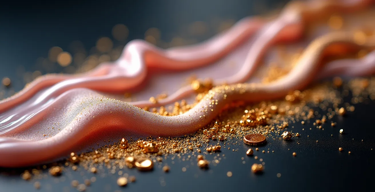
The tactile and visual richness seen in such imagery transforms a simple product into a desirable object. It is this elevation through narrative richness that forges a brand’s luxury identity. It tells a story of craftsmanship, exclusivity, and sensory pleasure that a simple, minimalist presentation often cannot. For a niche brand, this deep, maximalist world-building is the most powerful tool for creating perceived value and commanding a premium.
Now is the time to audit your brand’s visual language. The return of maximalism does not demand that every brand embrace chaotic clutter. Rather, it serves as a powerful prompt to ask a critical question: Does our visual identity communicate a unique story and authentic value, or have we retreated into the safe but sterile territory of the minimalist default? The answer will determine whether your brand leads the next chapter or becomes a footnote in this one.