Sensory packaging is not about aesthetics; it’s a psychological tool that directly manufactures perceived value before the product is even used.
- Physical weight directly influences a consumer’s belief in a product’s efficacy due to a principle called embodied cognition.
- Engineered sounds and textures create a multisensory ritual, building brand loyalty through satisfying haptic and acoustic feedback.
Recommendation: Shift your design process from testing features to testing behavior. Focus on engineering the consumer’s emotional and psychological response to the packaging itself.
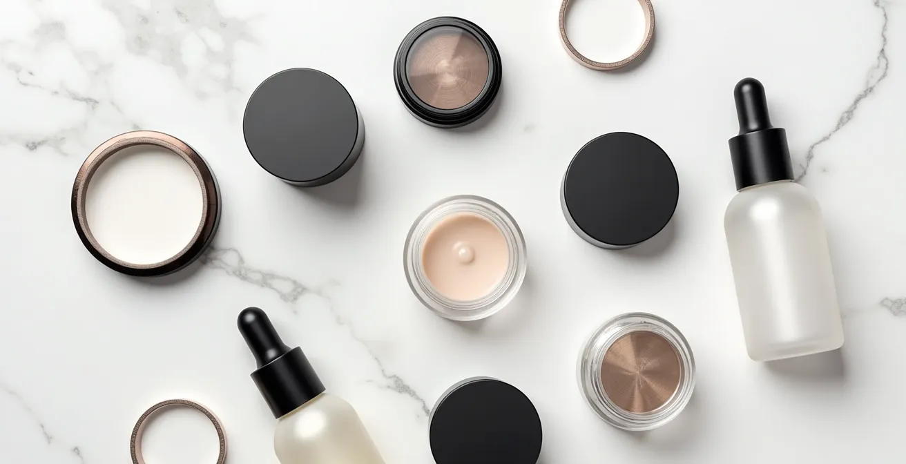
When a consumer unboxes a premium cosmetic product, a complex psychological event unfolds. It’s a ritual that begins long before the cream touches their skin or the fragrance scents the air. We often discuss this experience in terms of visual appeal—the elegant box, the beautiful font, the sophisticated color palette. But this view is remarkably incomplete. The most powerful messages are often conveyed not to the eyes, but to the hands and ears.
The common wisdom focuses on creating packaging that “looks good.” But what if the true differentiator, the secret to elevating a product from merely expensive to deeply valuable, lies in how it feels and sounds? This is the domain of sensory packaging, a discipline rooted in neuromarketing and consumer psychology. It’s about understanding that the physical interaction with a container is a silent, persuasive conversation with the consumer’s subconscious.
This article moves beyond the surface-level aesthetics. We will deconstruct the sensory triggers that convince a consumer of a product’s quality and effectiveness. We will explore the science behind why a heavy jar feels more potent, how a specific “click” can signal precision, and why the texture of a box can be as important as the formula inside. Prepare to see packaging not as a simple container, but as a masterfully engineered sensory experience.
To fully grasp how these elements work in harmony, this guide breaks down the key psychological and design principles. The following sections will provide a roadmap for transforming your packaging into a powerful tool for brand perception and consumer satisfaction.
Summary: Why Sensory Packaging Is the Silent Salesman for Premium Cosmetics
- Why Heavy Caps Make Consumers Believe the Cream Is More Effective?
- How to Select Soft-Touch Coatings That Mimic Skin Texture?
- The “Click” or the Twist: Which Closure Signals Higher Quality?
- The “Wrap Rage” Error That Ruins the Unboxing Video
- How to Engineer the “Pop” Sound of a Compact for Satisfaction?
- How to Redesign Packaging to Fit 20% More Units in a Container?
- How to Build an MVP That Tests Behavior Instead of Features?
- How Visual Storytelling Elevates a Niche Beauty Brand to Luxury Status?
Why Heavy Caps Make Consumers Believe the Cream Is More Effective?
The connection between weight and value is not just a cultural association; it’s a deeply ingrained cognitive bias known as embodied cognition. This principle suggests that our abstract thoughts and judgments are shaped by our physical, bodily experiences. When we hold something substantial and heavy, our brain automatically maps that physical sensation onto abstract concepts like “importance,” “seriousness,” and, crucially for cosmetics, “efficacy.” It’s a mental shortcut: heavy equals potent.
This isn’t just theory. The effect has been quantified, showing that consumers are willing to pay significantly more for the exact same product if it’s presented in heavier packaging. In fact, research published in Scientific Reports reveals that heavier packaging increases willingness to pay by 38% for identical products. This demonstrates a direct, measurable link between physical heft and perceived monetary value. The weight of the cap or jar doesn’t just contain the cream; it contains the promise of a more powerful formula.
Luxury brands have mastered this psychological lever for decades. They understand that the first moment of truth happens when the customer lifts the product from the shelf or out of its box. That initial feeling of substance sets the stage for the entire product experience.
Case Study: Dior Prestige La Crème Packaging Strategy
Dior’s Prestige La Crème is a masterclass in using weight to communicate luxury. The product features a meticulously crafted jar with an embossed logo and gold accents. More importantly, the significant weight and high-quality material of the jar immediately communicate sophistication and help justify the premium price point. This is a prime example of how physical heft translates directly to perceived efficacy in the luxury skincare segment, making the consumer believe in the product’s power before it’s even opened.
How to Select Soft-Touch Coatings That Mimic Skin Texture?
While weight communicates efficacy, touch communicates intimacy and pleasure. The surface of a cosmetic package is the first “handshake” with the consumer, and its texture can evoke powerful emotional responses. A soft-touch coating, designed to mimic the suppleness of skin, creates an immediate sense of comfort, luxury, and personal care. This haptic feedback is not merely a pleasant sensation; it’s a non-verbal cue that the product inside is gentle, nourishing, and designed for the body.
Selecting the right coating is a science. It goes beyond simply choosing a “soft” material. Factors like the coefficient of friction, fingerprint resistance, and durability are critical to maintaining the luxury experience over time. A coating that feels velvety upon first touch but scuffs easily or collects fingerprints will quickly shatter the illusion of quality. The goal is to create a consistent and resilient tactile signature that aligns with the brand’s promise, whether it’s the modern, silky feel of a tech-forward brand or the plush, comforting texture of a heritage skincare line.
The variety of available textures allows for precise emotional targeting. To truly understand the difference, one must consider the subtle variations available to designers.
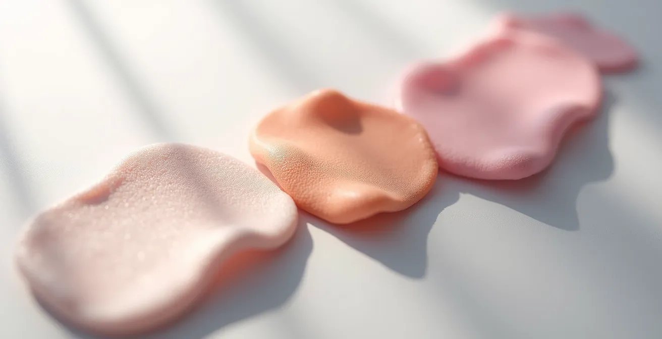
As this image suggests, the difference between a velvety, silky matte, or rubberized finish is significant. Each surface interacts with light and touch in a unique way, allowing designers to craft a specific haptic narrative that complements the product’s function and the brand’s identity. This level of detail is what separates standard packaging from a truly sensory experience.
Your Action Plan: Choosing the Right Soft-Touch Coating
- Test multiple coating samples with your target demographic to measure tactile preference scores.
- Measure the coefficient of friction using tribological testing to ensure a consistent and pleasant tactile sensation.
- Evaluate durability through rigorous fingerprint resistance and scratch testing protocols to ensure the luxury feel lasts.
- Compare velvety finishes for a sense of comfort versus silky matte finishes for an association with modern efficiency.
- Consider bio-resin or post-consumer recycled (PCR) materials to align a luxurious feel with an eco-luxe brand position.
The “Click” or the Twist: Which Closure Signals Higher Quality?
The way a package opens and reveals a product is key. Hidden compartments, magnetic closures, and ribbon ties can all elevate the moment.
– Lussopack Research Team, How Luxury Packaging Impacts Consumer Behaviour
The sound a package makes is its acoustic signature—a powerful, often overlooked, brand asset. The closure mechanism is the primary source of this sound, and its design can instantly signal quality, precision, or even the brand’s core philosophy. There is no single “best” sound; rather, the goal is to engineer an acoustic cue that is congruent with the brand’s identity. Is the brand clinical and precise, or is it about a slow, mindful ritual?
A sharp, high-frequency “click” from a compact or lipstick case conveys efficiency, security, and modern engineering. It assures the user that the product is safely sealed and the mechanism is well-made. Conversely, the silent, smooth resistance of a screw-top jar’s twist speaks to craftsmanship and heritage. It encourages a slower, more deliberate interaction, turning the simple act of opening the product into a moment of mindful anticipation. The choice between these auditory experiences is a strategic one that helps build the brand’s narrative.
The type of closure, its material, and the precision of its engineering all contribute to this auditory feedback. Minimalist, tech-forward brands might lean towards the silent, satisfying pull of a magnetic closure, which communicates innovation and effortlessness. Each option tells a different story.
This comparative analysis from recent industry research breaks down how different closure mechanisms are perceived by consumers.
| Closure Type | Acoustic Properties | Brand Association | Consumer Perception |
|---|---|---|---|
| Sharp Click | High frequency, short decay | Clinical, precise brands | Modern efficiency |
| Smooth Twist | Silent, consistent resistance | Heritage, ritual-focused | Craftsmanship |
| Magnetic Pull | Silent, effortless | Minimalist, tech-forward | Innovation |
The “Wrap Rage” Error That Ruins the Unboxing Video
The unboxing experience has evolved from a niche trend into a cultural phenomenon. With an estimated 25 billion views of unboxing videos on YouTube in 2024 alone, the way a product is revealed is now a critical marketing touchpoint. A successful unboxing is a seamless, satisfying, and visually appealing journey. The antithesis of this is “wrap rage”—the frustration and anger consumers feel when struggling to open overly complex, sealed, or poorly designed packaging. This isn’t just an inconvenience; it’s a moment of high cognitive friction that can create a lasting negative association with the brand.
In the context of luxury cosmetics, wrap rage is an unforgivable design flaw. It shatters the carefully constructed illusion of effortlessness and elegance. A consumer fumbling with a stubborn seal, tearing a delicate box, or unable to figure out how to open a container is the opposite of the graceful, empowering experience luxury brands promise. This frustrating moment is often captured and amplified in unboxing videos, turning potential brand advocacy into a public demonstration of poor user experience.
The key to avoiding wrap rage is to design for intuitive discovery. The packaging should guide the user’s hands, with clear affordances like pull tabs, ribbons, or magnetic clasps that make the opening process feel natural and rewarding. The goal is to create a sequence of small, satisfying reveals that build anticipation without causing frustration.
Case Study: Charlotte Tilbury’s Mystery Box Strategy
Charlotte Tilbury has masterfully leveraged the power of positive unboxing on platforms like TikTok with their “Mystery Boxes.” The brand periodically releases these curated sets, and the packaging is designed for a dramatic and satisfying reveal. The elevated, easy-to-open experience encourages a growing community of beauty enthusiasts to share their unboxing process. This strategy demonstrates the immense marketing power of intuitive, frustration-free packaging that is practically designed for social media sharing.
How to Engineer the “Pop” Sound of a Compact for Satisfaction?
The satisfying “pop” or “snap” of a cosmetic compact closing is not an accident; it is a feat of acoustic engineering. This sound serves as a powerful confirmation of quality and security. It provides instant auditory feedback that the product is closed, protected, and well-made. In a world of fleeting digital interactions, this tangible, physical feedback creates a moment of certainty and satisfaction. This is an example of cross-modal correspondence, where an auditory cue (the sound) enhances a tactile experience (the feeling of it closing), creating a more holistic and gratifying sensation.
Engineering this perfect sound involves a delicate interplay of material science, mechanical design, and psychoacoustics. The choice of plastic is fundamental: materials like ABS (Acrylonitrile Butadiene Styrene) are known for producing sharp, crisp sounds, while PP (Polypropylene) yields a softer, more muted acoustic profile. The geometry of the compact’s internal cavity also plays a crucial role, acting as a resonance chamber that can amplify or dampen the sound to achieve the desired effect.
Top luxury brands conduct extensive acoustic analysis, recording and benchmarking the sound profiles of iconic compacts to define their target soundscape. The goal is a sound that is not just functional but also emotionally resonant and aligned with the brand’s identity. The final step is to synchronize this auditory cue with the haptic feedback—the physical sensation of the latch engaging—to create a single, seamless moment of multisensory satisfaction.
Achieving this requires a methodical approach:
- Material Selection: Choose materials based on their acoustic properties. ABS plastic is ideal for sharp sounds, while PP creates softer acoustics.
- Geometric Design: Design the internal cavity to function as a resonance chamber, shaping the final sound.
- Benchmarking: Record and analyze the sound profiles of iconic luxury compacts to establish clear acoustic targets.
- Haptic Synchronization: Ensure the timing of the haptic feedback (the feel of the click) aligns perfectly with the auditory cue for maximum satisfaction.
- Holistic Soundscape Testing: Test the complete sound journey, from the initial opening to the final close, to ensure a coherent and high-quality narrative.
How to Redesign Packaging to Fit 20% More Units in a Container?
While the sensory aspects of packaging drive perceived value, the logistical efficiency of its design has a direct impact on both the bottom line and environmental sustainability. The concept of “smart luxury” embraces the idea that elegance can be efficient. Redesigning primary packaging to be more compact and space-efficient is not a compromise on luxury; it is an intelligent evolution that savvy consumers increasingly appreciate. By optimizing shape and form, brands can significantly increase shipping density.
This isn’t just about saving money on logistics. Denser shipments mean fewer trucks on the road, fewer containers on ships, and a smaller carbon footprint per unit. According to industry analysis, a 20% increase in shipping density can reduce the carbon footprint by approximately 18% per unit. This provides brands with a powerful sustainability story to tell—one that is backed by concrete, measurable improvements.
One of the most effective strategies for achieving this is through geometric optimization, such as using shapes that tessellate. Unlike circles, which leave significant wasted space when packed together, shapes like hexagons can fit together in a honeycomb pattern with almost no wasted volume.

As shown in this top-down view, hexagonal containers create a near-perfectly efficient grid. This design approach allows for a dramatic increase in the number of units that can fit into a shipping container or onto a retail shelf. This is intelligent design in action, where aesthetic form is in perfect harmony with logistical function, delivering benefits for the brand, the consumer, and the planet.
How to Build an MVP That Tests Behavior Instead of Features?
In the world of packaging design, it’s tempting to ask consumers what they want. “Do you prefer a matte or glossy finish? A click or a twist closure?” The problem with this approach is that people are notoriously bad at predicting their own behavior. They may say they prefer one thing but act in a completely different way when presented with the actual product. A more effective approach is to build a Minimum Viable Product (MVP) that is designed not to test features, but to test consumer behavior.
A packaging MVP doesn’t have to be the final, mass-produced item. It can be a series of high-fidelity prototypes that allow you to observe how consumers actually interact with the product. Do they handle it with care or casually toss it aside? Do they open it with a sense of anticipation or one of indifference? Do they display it on their vanity or hide it in a drawer? These behavioral cues are far more valuable than answers on a survey.
This methodology is about measuring the subconscious response to the packaging. By creating different versions that isolate sensory variables—one with a heavier cap, one with a different texture, one with a different sound—you can A/B test the packaging’s psychological impact and gather real-world data on which design drives the highest perceived value.
Behavioral Testing with Packaging MVPs: The Bamboo Bowl Study
A landmark study illustrated this principle perfectly. Researchers tested 60 participants with identical bamboo bowls. One group received the bowl in “economy” packaging (a plain brown box), while the other received it in “premium” packaging (a white box with inflated cushioning and a ‘thank you’ sticker). Participants only saw their own version. The results were stark: the group with the premium packaging rated the exact same bowl as being of significantly higher quality and value. This demonstrates the critical importance of behavioral testing; the packaging didn’t change the product’s features, but it fundamentally changed the consumer’s behavior and perception of it.
Key Takeaways
- Weight directly translates to perceived efficacy due to the psychological principle of embodied cognition.
- Sound and touch (haptics and acoustics) are as critical as visuals in defining a luxury experience and building a brand’s sensory signature.
- The unboxing process must be engineered to be frictionless and satisfying to create a positive emotional anchor and avoid the negative impact of “wrap rage.”
How Visual Storytelling Elevates a Niche Beauty Brand to Luxury Status?
Visual storytelling in packaging is not just about the logo or the color scheme. It is the culmination of every sensory detail working in concert to tell a cohesive and compelling brand story. A niche brand can ascend to luxury status when its packaging transcends its functional purpose and becomes a physical manifestation of the brand’s narrative and values. This is where all the elements we’ve discussed—weight, texture, sound, and ease of opening—come together to create a multisensory story.
When a magnetic closure clicks shut with satisfying authority, it tells a story of precision and innovation. When a heavy glass jar settles into the palm of the hand, it tells a story of potency and substance. When a soft-touch box evokes the feeling of skin, it tells a story of care and intimacy. These are chapters in a story told without words, and this form of communication is incredibly effective. In fact, BEAUTYSTREAMS research indicates a potential 70% increase in brand recall with multi-sensory strategies compared to those that rely on a single sense like vision.
This holistic approach allows a brand to create a deep emotional connection with the consumer. The packaging becomes a treasured object, a key part of the daily ritual that extends the brand experience far beyond the initial purchase. It’s this attention to the complete sensory journey that can give a small, niche brand the powerful presence of an established luxury player.
Case Study: Fenty Beauty’s Tactile Magnetic Closure System
Fenty Beauty’s Killawatt Freestyle Highlighter provides an excellent example of sensory storytelling. The product features a unique hexagonal compact with a magnetic closure system. That satisfying “snap” when it opens and closes is a distinctive tactile and auditory detail. It’s a small thing, but it’s memorable and feels premium. This sensory signature enhances the user experience and helps elevate the brand’s perception from a mainstream celebrity line to a genuine player in the prestige beauty space, demonstrating that storytelling is a multisensory art.
Start applying these sensory principles today to transform your packaging from a mere container into your brand’s most persuasive silent salesman.